Doom Review: Criticality
Criticality by Scotty
It’s a single, large boom compatible map with a length and vibe similar to Miasma by tourniquet. There’s two diverging, yet inter-crossing routes which set you off with either a plasma rifle or rocket launcher as your primary weapon, but you end up looping back around to complete both paths in order to unlock the final, more linear back end of the map. There are also some optional fights for those who are inclined with some nice rewards.
The fights have teeth on UV, but there’s nothing quite as exacting and claustrophobic as Miasma. Scotty describes them as being like the final maps in speed of doom in terms of difficulty and that’s quite accurate, I suppose, if the sheer length of the map isn’t factored into things. HMP and HNTR are both really well implemented with some intelligent monster substitutions that still retain the spirit of the fights and more generous distribution of resources.
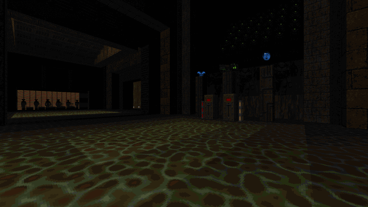
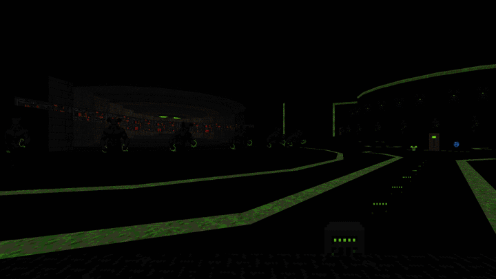
But here’s the unique selling point: The map is designed around software rendering and its quirks. Everything in the level is shrouded in gloom and shadow, but greens in the custom pallete have been marked as fullbright so you have computer displays, cacodemon eyes and other various re-touched sprites glowing in the darkness. It’s really pretty and visually striking combined with a tasteful application of OTEX resources and certain parts like the nearly pitch black core arena shocked me with how effective the lighting looked while still being readable in fights.
One of the best releases this year for my money. Give it a go but, please use a software renderer as intended. That means prboom over glboom or setting gzdoom to use “doom software renderer” in the video mode section of the options menu.
 cyberdemon.co.uk


