Doom Review: Wad Roundup (13th March 2022)
Ozonia by Deadwing
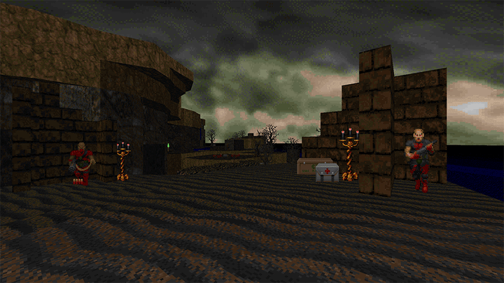
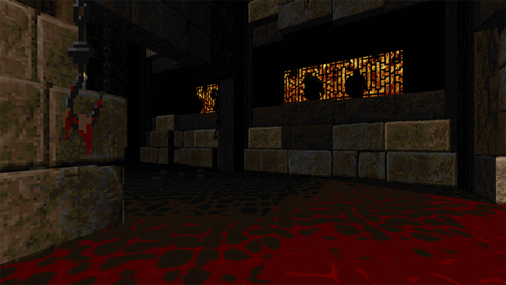
This is one i’d been looking forward to for a few years. Ozonia is a 32 map boom compatible megawad from Deadwing, the author of Moonblood/Exomoon. The maps are quite large and open in layout with a relatively low monster count, but that doesn’t translate to an easy experience. Like with Moonblood, enemy placement is exacting with monster combinations designed to put as much pressure on the player as possible. There are also a few setpiece encounters that demand a fair bit of strategic thinking with the resource on hand. There’s also a fair degree of non-linearity with multiple potential paths to take. All this leads to a somewhat methodical, slow pace. Think of something Plutonia-ish as opposed to the more aggressive style of a mid 2000s wad like AV or Scythe.
Difficulty is relatively mild. Deadwing says they were targeting something around Eviternity or Plutonia and that sounds about right. Things start to ramp up gently from episode to episode but it all feels relatively manageable. Hardest map for me was probably MAP28, which features a moderately sized fortress to assail with a consistently higher monster density than the other maps and a real dearth of resources. Unsurprisingly, this turned out to be a to be one of the guest maps by A2Rob. There’s a handful of other guest maps by Riderr3, Lorenz0 and Antares032 which all nail the style of Deadwing’s mapping and seamlessly integrate into the set. Antares’ map is one of the larger in the set and sits in slot 32. Looks good.
There are two custom monsters to deal with in this set: The hellion is an imp that moves very quickly and shoots a burst of plasma. There’s also the hierophant, a speedy mid-tier flying enemy that shoots a couple of mancubus projectiles and has a melee swipe. Both of these monsters have the ability to dash, rapidly closing the distance or dodging player attacks. They’re very effective and compliment the low density / high pressure design and the hellion is particularly lethal when seeded in with other monsters or deployed in a small groups. The plasma is very fast and capable of wiping out 100 health instantly if you aren’t careful and some of the ambushes can be incredibly awkward.
The set is broken up into a few episodes with a couple of intermission maps with lore dumps and some boss-like encounters (BFG vs four cyberdemons and a room full of hierophants - not too scary). I recall there being quite a few computer screens and stone tablets which communicate some sort of story in many of the maps, but I played this too long ago to remember details. It’s not the prettiest wad in the world but there’s a lot of variety and the theming is relatively unique. The inverted city-scape of MAP29 ascending into the red fog is particularly neat looking. Also the use of ice and the cloud stuff in the second episode. It’s all very competent and relatively tastefully done.
I really liked this. It’s a very different experience to the sort of aggressive monster-heavy maps I usually play and what wins all the attention these days. Cool.
Elysium’s Curse Episode 1 by Bri
An episode of six MBF21 compatible levels from Bri, who I am otherwise totally unfamiliar with. I have no idea what MBF21 features these levels use, but it’s fast becoming the new standard so make sure you have an up to date version of gzdoom, dsdadoom or eternity before trying this one out.
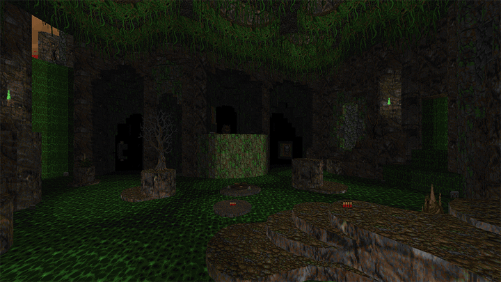
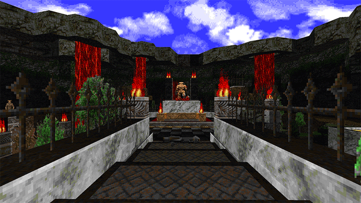
These maps are really, really pretty and make some of the best use of the OTEX texture set I’ve seen to date. The outdoor areas are lush and full of natural curves and height variation, but without falling into the pitfalls of being cramped and awkward, restricting sightlines or having too many of things to get caught on in the playable space (unlike say, “Crouching Tiger, Hidden Archvile” from Deus Vult 2). The episode follows a proper thematic progression with the exit of one map being logically connected to the entrance of the next, which I know is a big bonus for people who play with a focus on adventure and exploration, rather than freaks like me who prefer obtuse combat puzzles in abstract arenas.
In terms of gameplay it’s a a relatively straightforward affair, no more difficult than the middle levels of something like Eviternity. Maps are all 10-15 minutes in length and the whole set can be breezed through in an hour or so. It’s relatively casual linear journey from point to point with constant incidental combat broken up by the occasional arena or setpiece in the places you’d expect them. That said, the specific set-pieces show that Bri has a solid grasp of monster usage: Archvile turrets are used to restrict movement in the arena encounters in the first couple of maps and MAP06 features a cyberdemon turret controlling a large portion of the map while running the player through a series of awkward pins involving a relatively small number of enemies as they work around it.
My favourite encounter was a tiny U-shaped cave filled with pain elementals in MAP04 designed to lure the plasma wielding player inside to clear them out, before teleporting in a couple of barons in front of the now-barred exits and an archvile turret in the middle of the room with minimal cover. This leads to a classic bit of forced decision making and desperate improvisation as to decide who to shoot first. Focusing on the vile risks the barons walling the player in from both sides and the chaotic nature of pain elementals means what little space the player starts with will be likely be compromised from the moment the fight begins. What makes this little fight clever is how the exit bars are timed to re-open and allow for a potential escape just as the barons draw very close. That’s the sort of tight encounter design that makes Doom so special.
Definitely a mapset I think anybody could enjoy and it’s not a major time investment either. Absolutely worth your time.
akashic migraine by msx2plus
A single map release from msx2plus (Emma Essex), author of last year’s rather decent Time Tripper. Although it was supposed to be a boom compatible map it’s actually MBF21 format due to some sort of mistake on the part of the mapper, whoops!
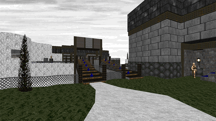
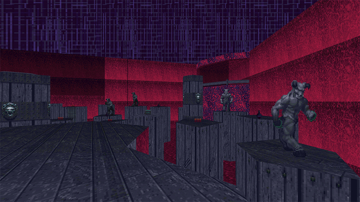
This map has a very unique look due to its striking desaturated palette which mixes greys with highlights in purple, red and emerald green, harsh angular geometry and unorthodox texture usage. Textures are deliberately tiled incorrectly and in clashing arrangements, with FIREBLU sitting next to corrupted door textures and grey bookcases. Some of the wall textures are set to scroll very fast in random directions and some areas and bits of platforming are shrouded in darkness or have pulsing sector lighting. To add to the sensory overload, msx2plus has composed quite a nice drum and bass soundtrack in tracker format to go with it all. End result is either something that’s quite exciting to look at or a recipe for vertigo, depending on your tolerance. I quite liked it and appreciated its noisy charms, but did end up muting the soundtrack when I went back to record a few demos after my first playthrough.
In terms of how it plays - things are deliberately awkward and the focus on platforming will certainly drive away a lot of people. The platforming sections are mandatory for progression, but honestly they aren’t that bad if you take them slowly and clear out any nearby monsters before getting underway. There are no silly SR50 jumps or monster ambushes midway while tackling them. The trickiest bit is following a very thin ledge in pitch darkness, the way illuminated by a trail of flashing health files followed by a basic strafe jump down into a waiting arena. Just make saves if you are worried about it.
When it comes to combat, the map doesn’t put its best foot forward at the start with a lengthy maze of bookcases, doorways and pinkies to get to the first key, which then repopulates with an archvile and a bunch of revenants. It’s not difficult, it’s just a pain to clear out efficiently and not get punched in the back of the head. Revenants like to wander off and get stuck in strange places, threatening to reappear at inappropriate times.
The rest of the map improves considerably, so long as you are comfortable fighting in confined spaces and atop narrow platforms. There’s a lot of controlling space while avoiding being smothered by monsters or pushed into pits and onto damaging sectors: There’s a nice rocket encounter on a staircase against a wall of approaching revenants and the arena fight with the giant damaging sector lake and little mound in the middle can be tackled in a few ways, with pain elementals that make staying high and dry a dangerous proposition. The BFG fight against a horde of revenants and a cyberdemon on a narrow raised circular platform is intimidating but the space only naturally allows for dodging in a big U shape, and that works absolute wonders so long as you keep an eye out for stray cyberdemon rockets. My main disappointment was the final fight of the map, which was a bit of a damp squib. At that point the BFG just melts everything and the level of opposition is trivial given the amount of space available. A strange and unfitting way to end a map that otherwise was so heavily based on restricting the player’s movement.
I really enjoyed this but it’s definitely not for everyone. It’s a bit like a neutered version of toilet of the gods or sunder map05 in places - quite challenging but not impossible. Worth trying out if only to admire the construction.
Vigor by Egg Boy, Juza, ZeMystic, T.Will, Skronkidonk, DCG Retrowave, mxbobbie49 & Bobby
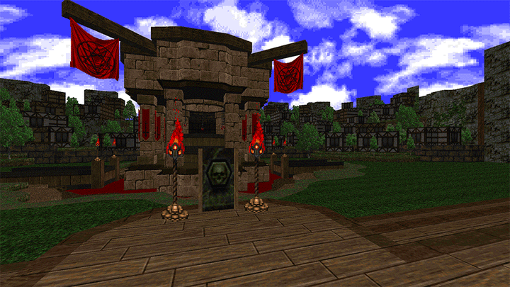
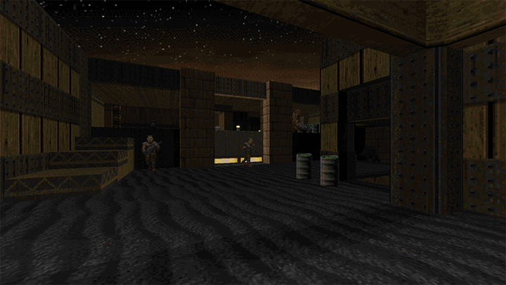
A vanilla compatible community megawad (20 maps) styled around Scythe. Simple and clean geometry with a strong focus on combat. Like scythe, most of the maps are short, punchy affairs but there are a few outliers here and there, notably MAP05 and a couple of the later maps. Aesthetically, it really nails the feel of scythe and other older megawads like alien vendetta. The music is a bit more modern and eclectic, with some tracks pinched from Doom 2 in Spain Only and also a midi rendition and Bad Apple - believe it or not the first time I’ve ever heard that in a doom wad.
For the most part is plays really well and feels like Scythe should. The base level of difficulty is higher than Scythe starting out and it ratchets up steadily. There are a a few areas and entire maps that are clear homages to Erik Alm’s originals. One that sticks out most is the penultimate map “Segway to Hell”, which is a clone of the penultimate map of scythe “Hell on Earth” but with much harsher enemy placement. There’s also a gentle little slaughtermap, but luckily no Run From It clone.
Monster counts are relatively low but encounters are aggressive and dangerous. Health is also quite limited in some of the maps, making poor enemy prioritisation vs hitscanners and small mistakes count a great deal. The scales are tipped a bit too strongly against the player in some ambushes, where the demand to adapt to point blank chaingunners and mid tier monsters when the player has no armour leaves only a tiny margin of error. Given most maps are only 5-10 minutes long, that’s not necessarily a bad thing, but expect some gotcha deaths. The most egregious example of this I can think of is the final blind drop in MAP11 into a cave with a hurtfloor, three archviles, a couple of arachnotrons and other assorted midtiers blocking the high ground and virtually no space to move.
The overall quality of the maps is pretty variable - like with any community project there are a few less decent maps in the mix and a few that don’t really feel particularly scythe like. MAP05 is very strange being much longer than the maps around it and starving the player of any ammo for the first half, effectively forcing them through a gauntlet of monsters blindly. It’s not a bad map, but it felt like it came ten slots too early. Most maps have a few decent fights and ideas regardless. Big fan of the rocket launcher fight in MAP19 with the A-shaped layout, a great wall of hell knights pressing in and a vile turreted happily in the middle of great mass of monsters.
Just to warn you, the plasma marine from Scythe 2 is back to terrorise a handful of the later maps. Thankfully, they’ve gotten fat so they’re much slower but with a bit more health to compensate. These guys are manageable, but still incredibly dangerous in an ambush. The extra health makes them irritatingly resistant to rockets, which is best demonstrated in MAP11 while trying to kite them around an awkwardly narrow cave littered with random things (please don’t do this!).
Pretty good stuff in all. I’d strongly recommend playing each map from a pistol start and skipping over any maps you don’t really find enjoyable.
Moonlit District by Egg Boy, ZeMystic, T.Will & Skronkidonk
A collection of 7 more vanilla-compatible speedmaps from Egg Boy and chums. I played this immediately after Vigor so a lot of the details are kind of a blur. All of the maps used the Perdition’s Gate texture set which honestly is quite an ugly and limited set of textures. They’re also speedmaps, so don’t expect a great deal of detailing and fancy lighting. As a result, most of the maps look really similar to one another. The lift textures in this look very similar to walls, leading to a couple of confusing moments.
On the plus side, these maps all play pretty well. Very similar in design philosophy to Vigor, which I guess isn’t surprising given they were made roughly at the same time by the same group of mappers. Just more of that mid 2000s combat with the same sort of aggressive ambushes and traps. Beware of the hitscan ambushes and surprise archviles. Difficulty and monster count steadily rises through the maps, but it’s much easier than Vigor on the whole.
If you liked Vigor I’d recommend giving it a go. It’s a nice way to burn an hour.
 cyberdemon.co.uk
